

WebCenter Portal - Access to WC Spaces Services over REST running on Oracle VM from your Mobile Application
By: Andreja Sambolec - Application Consultant
5 min read
By: Andreja Sambolec - Application Consultant
If you want to change the default template and skin for your Spaces application, the first step is to create a new template and skin based on the OOTB template which looks similar to the design you want, and apply them to the Spaces application.
In our example we want to have the menu on the top of the page so we created a new template based on the ‘WebCenter Spaces Top Navigation’ template.
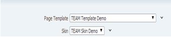
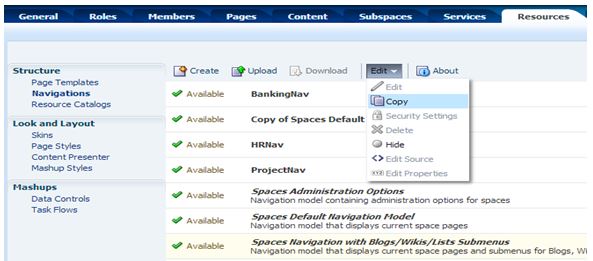
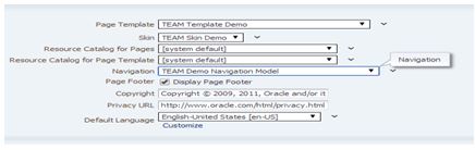
You can create a new template and skin from the ‘Resources’ tab (Administration-> Spaces-> select Space and select ‘Edit space’).
You can apply your new template and skin using the General tab:
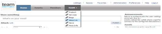
The default menu looks like this:
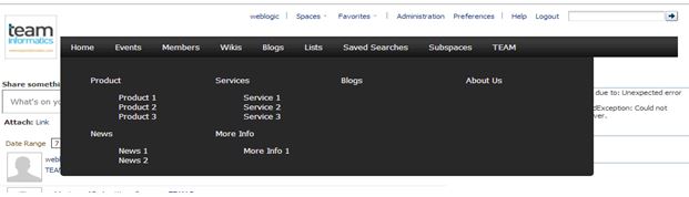
We want to have something like this:

And this is how the drop-down menu should look:

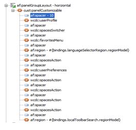
We need to change the template because the logo icon has to be on the left side of the menu.
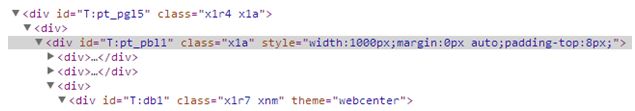
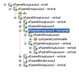
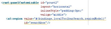
The best way to find what has to be changed is:
Now you can easy see the structure of the template and decide what to change.
This is the result:
New order:
The result:
Next we want to change the menus background color.
The background color for the global menu should be in white.
Steps to change:
When we deselect the background image for .WCSiteTemplateBackground, .x1r4,
we don’t see the background color anymore on the top of the page .
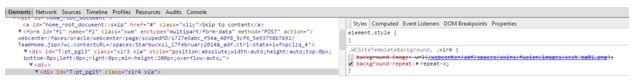
.WCSiteTemplateBackground{
background-image:none;
}
When you are checking out the styles for some components, you will not see the name of the component but some code, for example, .x106 (the skin is compressed).
You can apply changes using those compressed names or if you know, for example, which component is used you can try with af|commandLink. You could also open the page fragment in jdeveloper and check which component and style class is used and use it in your skin to add changes.
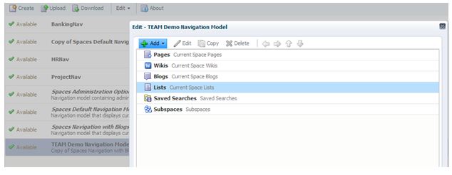
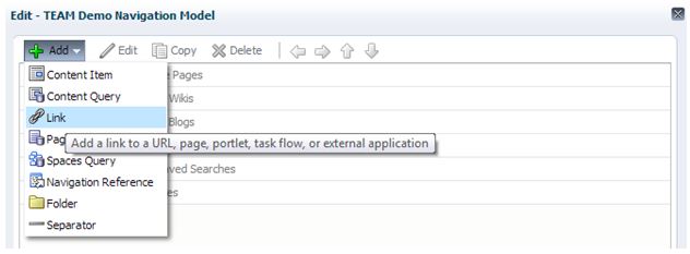
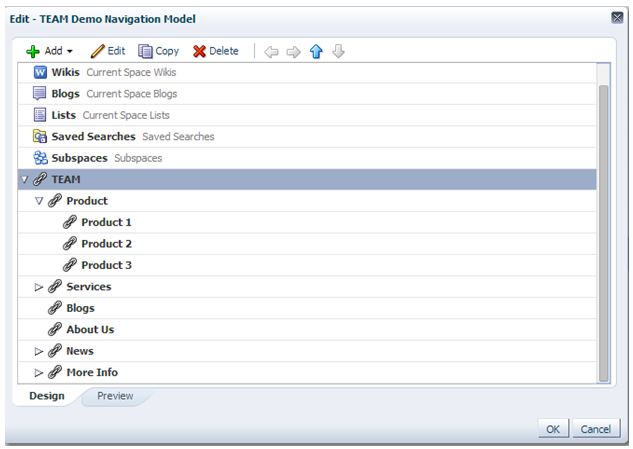
We also want to add some new pages, so we are going to change the navigation model.
 We currently don’t see any sub-menus, so next we are going to change the menu component in our template.
Search for this component in your template file and you can see a region (task-flow) is used to display the menu.
We are going to replace this region with this code (loop through the navigation model and its children):
<div class="menu">
<c:set var="navNodes" value="${navigationContext.defaultNavigationModel.listModel['startNode=/, includeStartNode=false']}" scope="session"/>
<ul id="topnav">
<c:forEach var="menu" varStatus="vs" items="${navNodes}">
<li><a href="/webcenter${menu.goLinkPrettyUrl}"> ${menu.title}</a>
<c:if test="${not empty menu.children}">
<div class="submenu"><table width="100%"><tr><td>
<ol class="blocks-four-up">
<c:forEach var="child" items="#{menu.children}">
<li>
<p><a href="/webcenter${child.goLinkPrettyUrl}">
${child.title}
</a></p>
<c:if test="${not empty child.children}">
<ol>
<forEach var="child1" items="#{child.children}">
<li><a href="/webcenter${child1.goLinkPrettyUrl}">
${child1.title}
</a></li>
</c:forEach>
</ol>
</c:if>
</li>
</c:forEach>
</ol>
</td></tr></table></div>
</c:if>
</li>
</c:forEach>
</ul>
</div>
You can find the meaning of EL expressions related to Navigation in this document:
http://docs.oracle.com/cd/E23943_01/webcenter.1111/e10148/jpsdg_app_els.htm#CHDCBJGJ
.menu ul#topnav{
margin-top: 18px;
padding: 0;
float: left;
width: 880px;
position: absolute;
list-style: none;
position: relative;
font-size: 1.2em;
background:url(http://1-ps.googleusercontent.com/h/www.htmldrive.net/edit_media/2010/201007/20100728/Horizontal%20Subnav/images/xtopnav_s.gif.pagespeed.ic.v1mnjAEAt5.webp) repeat-x;
}
.menu ul#topnav li .submenu{
padding: 15px 0;
position: absolute;
left: 0; top:35px;
display: none;
width: 760px;
background: #282828;;
color: #fff;
z-index:1;
-moz-border-radius-bottomright: 5px;
-khtml-border-radius-bottomright: 5px;
-webkit-border-bottom-right-radius: 5px;
-moz-border-radius-bottomleft: 5px;
-khtml-border-radius-bottomleft: 5px;
-webkit-border-bottom-left-radius: 5px;
}
.menu ul#topnav li{
float: left;
list-style: none;
}
.menu ul#topnav li:hover.submenu{
display:block;
}
.menu ul#topnav li a {
padding: 10px 15px;
display: block;
text-decoration: none;
color: #f0f0f0;
}
.menu.blocks-four-up{
list-style: none;
position:relative:;
}
.menu.blocks-four-up>li {
float: left;
width: 25%;
}
.menu#topnav.blocks-four-up>li ol li{
float: none;
}
.menu ul#topnav li .submenu a {
padding: 10px 0;
display: inline;
color: #f0f0f0;
text-decoration: none;
}
<af:resource type="css">
.blocks-four-up>li:nth-child(4n+1)
{clear:left;}
</af:resource>
The result:
Next, we want to display the ‘More Info’ menu at the bottom.
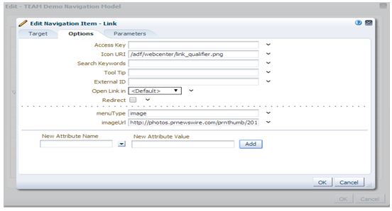
How do we know which menu we are going to use as a bottom menu? We can add some attribute (menuType) to the menu using the navigation model:
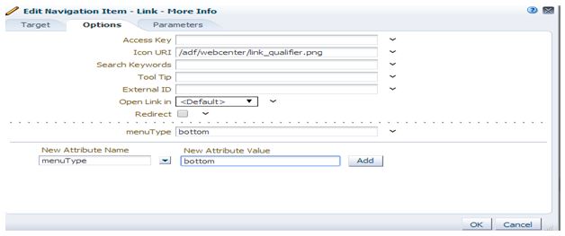
Change the template :
<c:forEach var="child" items="#{menu.children}">
<li>
<c:if test="${child.attributes.menuType != 'bottom'}">
<p>
<a href="/webcenter${child.goLinkPrettyUrl}">${child.title}</a>
</p>
<c:if test="${not empty child.children}">
<ol>
<c:forEach var="child1" items="#{child.children}">
<li>
<a href="/webcenter${child1.goLinkPrettyUrl}">
${child1.title}</a>
</li>
</c:forEach>
</ol>
</c:if>
</c:if>
<c:if test="${child.attributes.menuType == 'bottom'}">
<c:set var="bottomMenu" value="${child}" scope="session"/>
</c:if>
</li>
</c:forEach>
</ol>
<p class="menu_bottom_title">
${bottomMenu.title}
</p>
<ul class="menu_botom_links">
<c:forEach var="child1" items="#{bottomMenu.children}">
<li>
<a href="/webcenter${child1.goLinkPrettyUrl}">
${child1.title}</a>
</li>
</c:forEach>
</ul>
Add/change this to the skin:
.menu ul#topnav li .submenu.menu_bottom_title{
clear: both;
margin: 0 8px .5em 12px;
padding: .75em 27px 0;
border-top: 1px solid #5e5f62;
font-weight: normal;
font-size: 1.230769em;
line-height: 1.125;
}
.menu.blocks-four-up>li ol{
-webkit-padding-start: 0;
}
.menu.blocks-four-up>li {
float: left;
width: 25%;
padding-bottom: 5px;
}
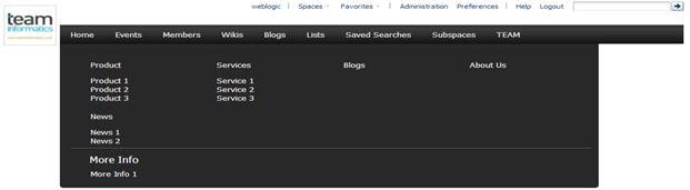
Using the same directions, we are going to add some images on the right side of the menu:
Change your template (apply changes related to image in red color):
<td width="85%"><ol class="blocks-four-up">
<c:forEach var="child" items="#{menu.children}">
<li>
<c:if test="${ child.attributes.menuType != 'bottom' && child.attributes.menuType != 'image'}">
<p><a href="/webcenter${child.goLinkPrettyUrl}"> ${child.title}</a></p>
<c:if test="${not empty child.children}">
<ol>
<c:forEach var="child1" items="#{child.children}">
<li>
<a href="/webcenter${child1.goLinkPrettyUrl}"> ${child1.title}</a>
</li>
</c:forEach>
</ol>
</c:if>
</c:if>
<c:if test="${child.attributes.menuType == 'bottom'}">
<c:set var="bottomMenu" value="${child}" scope="session"/>
</c:if>
<c:if test="${child.attributes.menuType == 'image'}">
<c:set var="linkimage" value="${child.attributes.imageUrl}" scope="session"/>
</c:if>
</li>
</c:forEach>
</ol>
<p class="menu_bottom_title"> ${bottomMenu.title} </p>
<ul class="menu_botom_links">
<c:forEach var="child1" items="#{bottomMenu.children}">
<li>
<a href="/webcenter${child1.goLinkPrettyUrl}"> ${child1.title}</a>
</li>
</c:forEach>
</ul>
</td>
<td width="15%" valign="top"><img src="${linkimage}"/></td>
Finally, we want the submenu to cover the entire page.
To do this:
<af:panelGroupLayout id="pt_pgl5" layout="vertical" styleClass="WCSiteTemplateBackground">
<div id="submenu"/>
<af:panelGroupLayout id="pt_pbl1" layout="vertical" inlineStyle="width:#{attrs.templateFixedWidth}px;margin:0px auto;padding-top:8px;">
We are going to clone the submenu in a mouse over action with this container.
<af:resource type="javascript">
function showSubmenu(e){
var childrens = e.parentNode.children;
var len = childrens.length;
document.getElementById("submenu").innerHTML = '';
for (i = 0; i < len; i++) {
if(childrens[i].className== "submenu"){
newNode=childrens[i].cloneNode(true);
document.getElementById("submenu").appendChild(newNode);
}
}}
</af:resource>
<a href="/webcenter${menu.goLinkPrettyUrl}" onmouseover="showSubmenu(this)">
.menu ul#topnav li:hover.submenu{
display:none;
}
div#submenu.blocks-four-up>li ol li{
float: none;
}
div#submenu.blocks-four-up>li {
float: left;
width: 25%;
padding-bottom: 5px;
}
div#submenu.blocks-four-up{
list-style: none;
position:relative:;
}
div#submenu.blocks-four-up>li ol{
-webkit-padding-start: 0;
}
div#submenu.menu_bottom_title{
clear: both;
margin: 0 8px .5em 12px;
padding: .75em 27px 0;
border-top: 1px solid #5e5f62;
font-weight: normal;
font-size: 1.230769em;
line-height: 1.125;
}
div#submenu div{
padding: 15px 0;
position: relative;
left: 0;
width:1000px;
display: block;
background: #282828;
color: #fff;
margin: 0 auto;
}
div#submenu {
width:100%;
top: 90px;
position: absolute;
z-index: 3;
background: #282828;
}
div#submenu li{
margin-bottom: .3076923em;
}
div#submenu p a{
font-weight:bold
}
div#submenu p {
margin-bottom: 3px;
}
div#submenu a{
padding: 10px 0;
display: inline;
color: #f0f0f0;
text-decoration: none;
}
div#submenu div>ol {
min-height: 109px;
list-style: none;
}
div#submenu div>ol ol {
padding:0px;
list-style: none;}
div#submenu div>table tr td ol ol {
padding:0px;
list-style: none;
}

You also need to add an event to clear the container when exiting from the submenu.
Those are the basic steps to change the template and skin of your Portal application.
Using a browser Developer Tool enables you to discover which component has to be changed or what to change in your skin.
Any questions? Feel free to contact us.