1 min read
By: Andreja Sambolec - Application Consultant
Sometimes, you want to customize your checkbox component by changing the background color.
This can be done using CSS and :after and :before pseudo classes on checkbox elements.
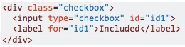
This is what a checkbox looks like:
The condition necessary to be able to change the background color:
The element must precede the
The steps to style a checkbox:
#1 Hide the checkbox
input[type=checkbox] {

opacity: 0;

}
#2 Use :checked and :before pseudo classes to style checkbox
.checkbox input[type=checkbox]:checked + label::before{

content: 'ON';

background-color: #428bca;

}
Read more on these steps here.
So, how do you apply these steps to ADF components?
To display a checkbox component in ADF, we are using af:selectBooleanCheckbox element:
<af:selectBooleanCheckbox value="#{bindings.InternalApplication1.inputValue}"
text="#{bindings.InternalApplication1.label}"
styleClass="checkbox"
shortDesc="#{bindings.InternalApplication1.hints.tooltip}"
id="sbc1"
disabled="true"/>
There are two options to set the label:
- Using label attribute– it’s placed before input component
- Using text attribute – it’s placed after input component
When using text, the result is:
<td valign="top" nowrap="" class="AFPanelFormLayoutContentCell">
<span class="af_selectBooleanCheckbox_content">
<span class="af_selectBooleanCheckbox_content-input">
<input id="r1:0:sbc4::content" name="r1:0:sbc4" class="af_selectBooleanCheckbox_native-input" type="checkbox" value="t" checked="" onclick="this.focus()">
<label for="r1:0:sbc4::content" class="p_OraHiddenLabel"></label>
</span>
<label for="r1:0:sbc4::content" class="af_selectBooleanCheckbox_item-text">Refugee</label>
</span>
</td>
When using label, the result is:
<tr class="checkbox af_selectBooleanCheckbox p_AFDisabled" id="r1:0:sbc1" _adftrc="r1:0:sbc1::icon-style">
<td class="af_selectBooleanCheckbox_label af_panelFormLayout_label-cell">
<label class="af_selectBooleanCheckbox_label-text" for="r1:0:sbc1::content" id="r1:0:sbc1::contentlabelId">Internal Application</label>
</td><td valign="top" nowrap="" class="AFPanelFormLayoutContentCell">
<span class="af_selectBooleanCheckbox_content">
<span class="af_selectBooleanCheckbox_content-input">
<input id="r1:0:sbc1::content" name="r1:0:sbc1" disabled="" class="af_selectBooleanCheckbox_native-input" type="checkbox" value="t" checked="" onclick="this.focus()" aria-labelledby="r1:0:sbc1::contentlabelId">
</span></span>
</td></tr>
We can see that only the option with text works because the label is set after the input element.
If you have the readOnly attribute set to ‘true’, replace it with ‘disabled=true’. This will make it easier to style.
This is what the CSS should look like:
/**hide checkbox*/
.checkbox input[type="checkbox"] {
opacity: 0;
width: 0px;
}/*style label to display checkbox*/
.checkbox .p_OraHiddenLabel {
position: relative;
left: inherit;
font-size: 12px;
top: inherit;
content: "";
display: inline-block;
position: relative;
width: 17px;
height: 17px;
left: inherit;
margin-left: 0px;
border: 1px solid #cccccc;
border-radius: 3px;
background-color: #428bca;
border-color: #428bca;
}/*style for unchecked state
Set the content to have no issues with moving elements when switching between states – the content is hidden, but save space for it.
*/.checkbox input[type="checkbox"]:not(:checked) + label:before {
content: "ON";
color: #428bca;
display: inline-block;
}/*style for checked state*/
.checkbox input[type="checkbox"]:checked + label:before {
font-family: 'FontAwesome';
content: "\f00c";
display: inline-block;
}/*styling disabled chheckbox*/
.checkbox input[type="checkbox"]:disabled + label {
background-color: #428bca;
border-color: #428bca;
opacity: 0.65;
}/**/
af|selectBooleanCheckbox::item-text {
margin: 0px 1px;
padding-right: 3px;
padding-left: 2px;
vertical-align: middle;
margin-left: 1px;
left: -167px;
position: relative;
}/**hide checkbox*/
.checkbox input[type="checkbox"] {
opacity: 0;
width: 0px;
}af|selectBooleanCheckbox::content {
line-height: 19px;
}
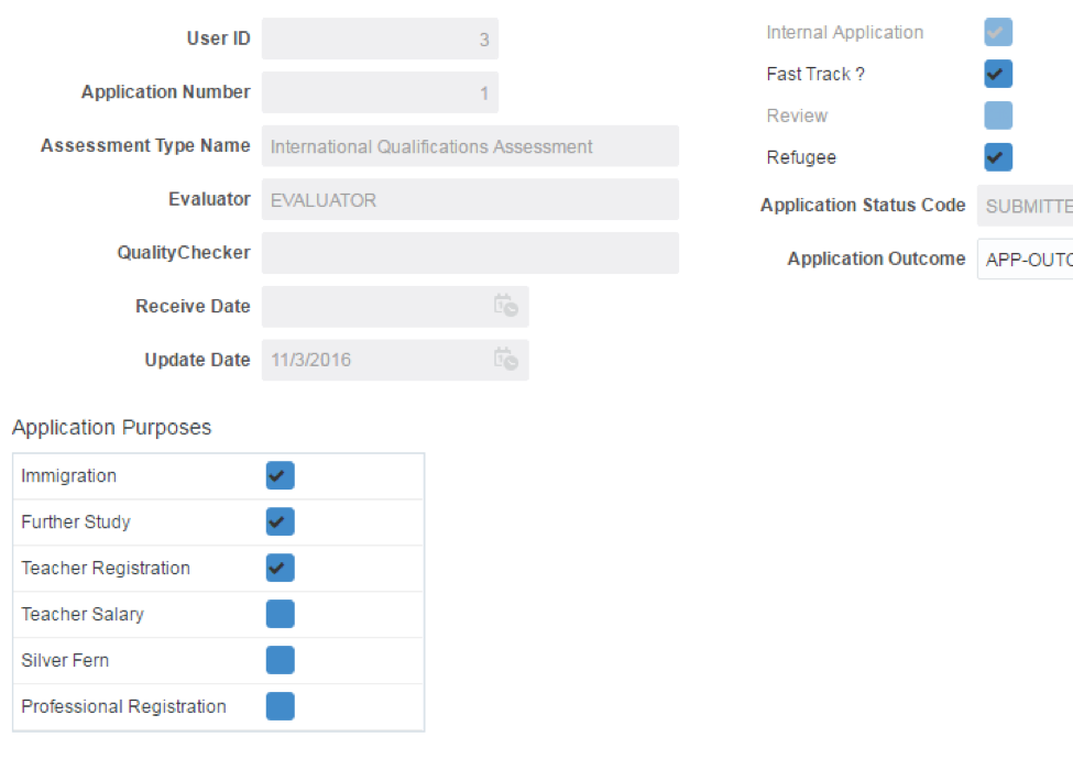
The end result: